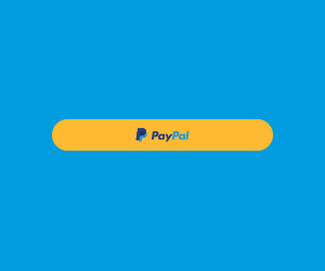
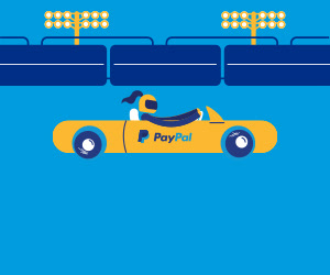
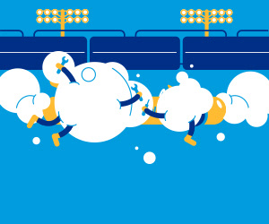
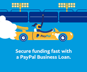
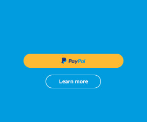
This is just a small sampling of the banners I created for PayPal's new ad campaign with Swift.
I was given the character illustrations, fonts and colors, but I was able to decide how each banner ad was going to be laid out and what extra elements should be brought into the design. I also worked closely with art directors to figure out how each banner design should animate. From there, motion designers would take my storyboards and animate each one.
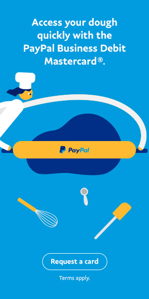
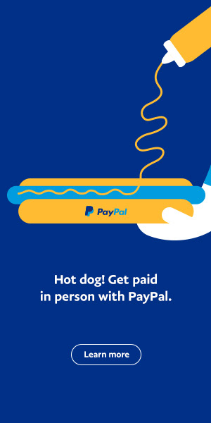
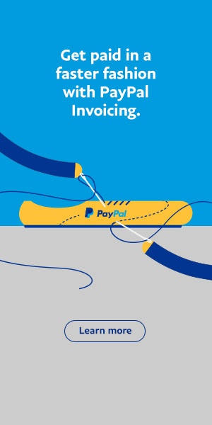
Below is a sample of one banner ad created in 5 different sizes.
This was needed for each character concept I was given.
The team needed a sample of how one “gift” GIF should look in motion. I created this example in Photoshop, and then it was given to the motion designers to create in multiple different sizes.
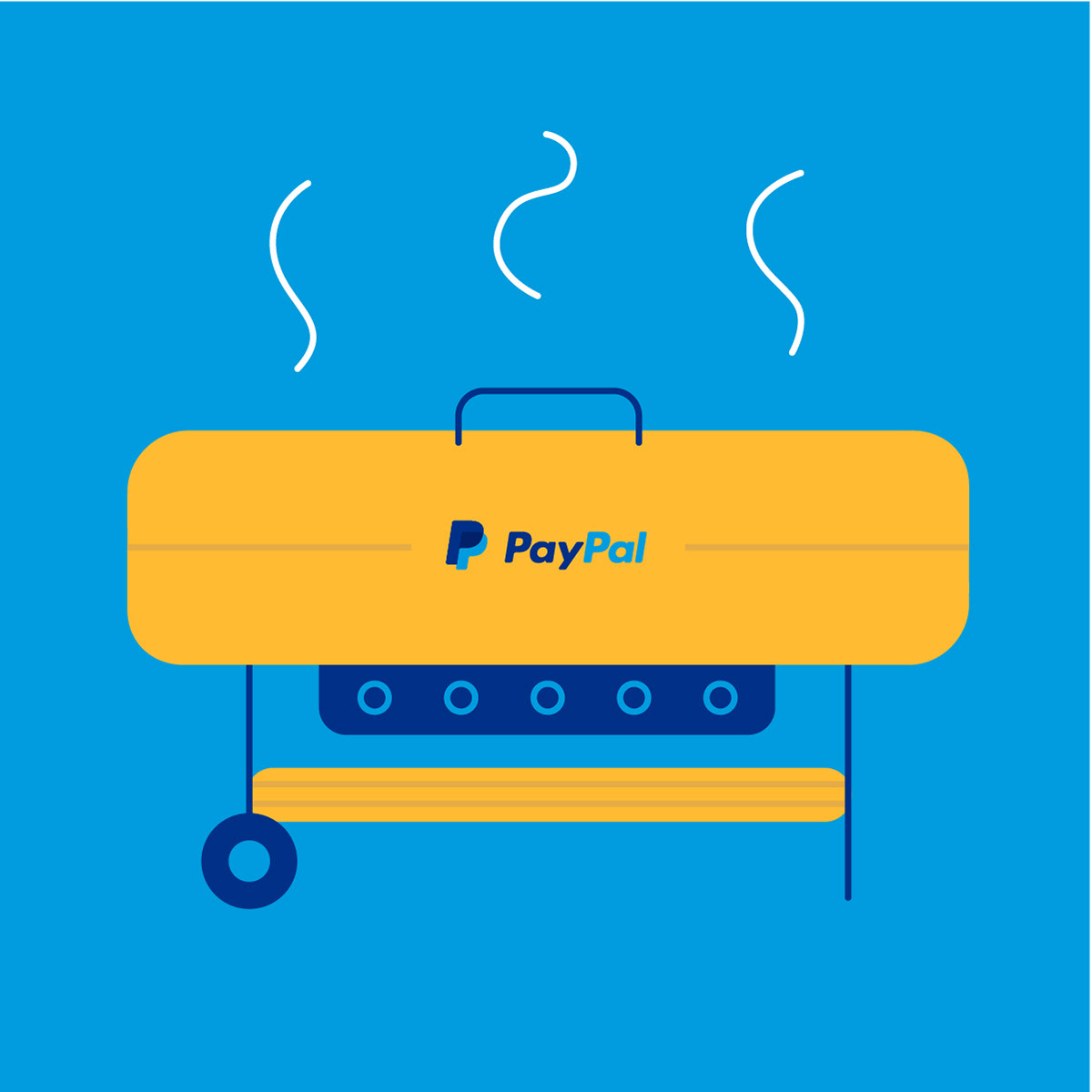
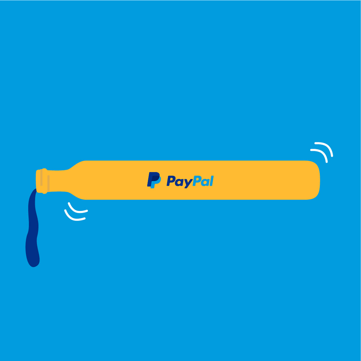
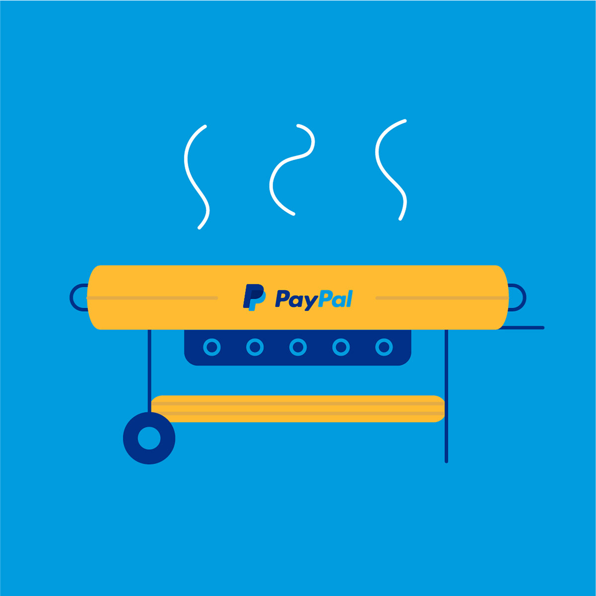
Here I explored some "BBQ" illustration techniques for the yellow PayPal button. Sometimes I was asked to explore variations on illustrations if the freelance illustrators were too busy and I had some time on my hands.
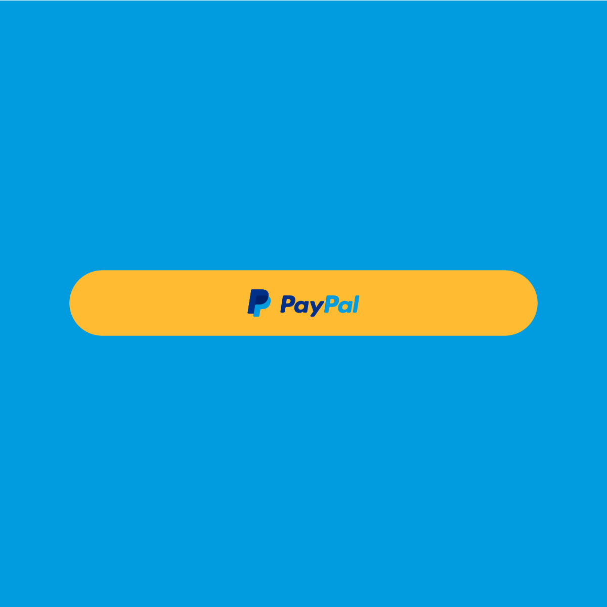
This is an example of how I would storyboard a motion banner design. From the plain yellow button on the left, it turns into a car with a driver, then the crew comes in to fix the car, and the car takes off with text appearing below it. Then, it turns back into the button with the CTA dropping down below.
